UI & UX in Field Service Software – Why it does matter
December 13, 2019Field Service Software
This is the first part of our series “Field Service Software - Why it does matter”. In this series, we dive into different aspects and features of field service software and explain why they are important, and how they help field service businesses create outstanding teamwork, deliver value and get the job done.
If you’ve been using any kind of software, for business or personal use, you might have come across the terms: UI and UX.
UI stands for User Interface and UX stands for User Experience.
While these acronyms are often used in the tech world, we believe their application goes far beyond the tech realm.
What is UI?
User Interface (UI) generally refers to the visual elements and the overall aesthetics of a product. The choice of colours, positioning of elements, effects and transitions after an interaction is considered as UI.
What is UX?
UX is a blurrier term. It’s about general user satisfaction when using a product. Even if you realise it or not, every interaction with a product creates emotions and reactions. Over time you have more of these interactions and they produce the user’s subjective experience and feelings with a product.
‘User experience’ encompasses all aspects of the end-user’s interaction with the company, its services, and its products. - Don Norman, Author of “The Design of Everything”
Why good UI & UX are important
Have you ever had an experience with a product or service that was so bad, that your immediate reaction was to never repeat this experience again? In some extreme cases, bad UI/UX can build up to resentment or become a deal-breaker for its users.
On the contrary, good UI/UX in software can help with:
- reducing user errors
- quicker onboarding of new users
- increasing user engagement
- increasing productivity through an easy, repeatable, consistent experience
The ultimate goal of good UI & UX is to reduce friction!
5 benefits of good UI/UX for field service businesses
The more complex your work is, the more important it is to have technology and software that is easy to use and understand. Consumer technologies are pioneers in that field and their advancements are trickling down to business software too.
When it comes to field service software, an intuitive user interface and good user experience can make or break your business.
Intuitive UI and sophisticated UX in job management software helps you with
1. Shorter onboarding time & less training: you won’t need 10 hours of training before your people can start using a tool.
2. Increased data quality: less rework and fewer headaches during audits.
3. Reduced human errors: by offering automatic calculations and hiding irrelevant fields.
4. Reduced rework: by displaying only relevant information to each user and mandatory fields.
5. Smooth business operations: with less rework, less training and ultimately smoother processes, UI & UX free you up to focus on the bigger picture.
UI / UX is everywhere
UI and UX are not limited to software and technology products. They can be applied to almost anything. Here are four examples:
Communication
How does communication relate to UI/UX? One major component of UI/UX is “interfacing”. Language is a prime example of an interaction between people.
If you read the Roosevelt government’s 1942 blackout order memo.
Such preparations shall be made as will completely obscure all Federal buildings and non-Federal buildings occupied by the Federal government during an air raid for any period of time from visibility by reason of internal or external illumination
Translation:
Put something across the windows in buildings where they have to keep working.
I think we all agree that the first sentence hard to read and understand while the second sentence is clutter-free and gets immediately to the point. That is a good user experience in the broadest of terms.
Objects
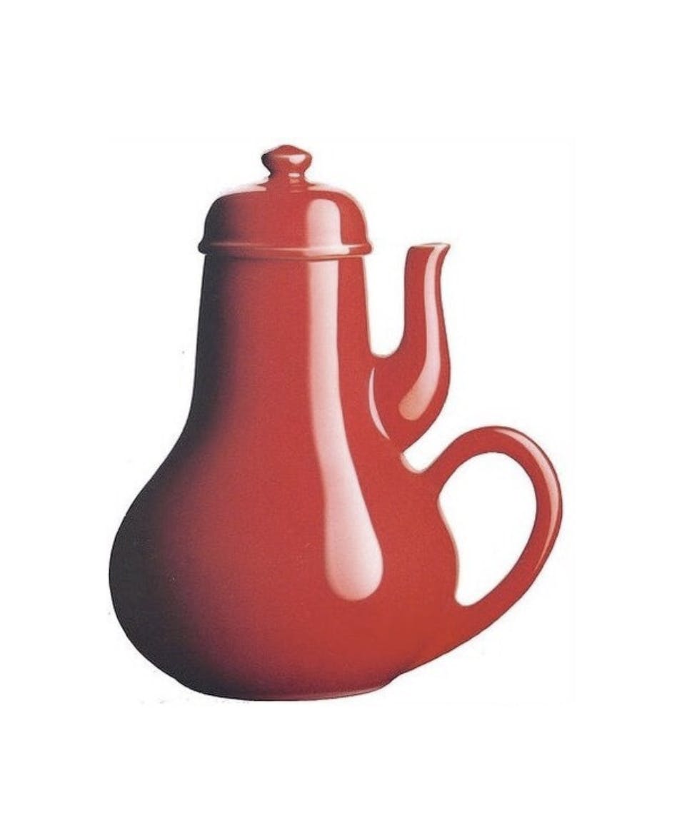
Simple objects can make a simple task incredibly hard when UI/UX is not considered. Look at this teapot, for example. Wouldn’t you get frustrated when trying to pour yourself a hot cup of tea?
Flight instruments
Would you board a plane that is flown by a pilot with no proper training or introduction to the flight deck? No, because planes are very complex and so is the use of their dashboards.

Paperwork
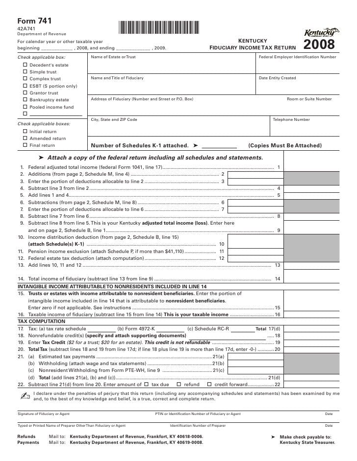
Tax forms are a prime example where good UI & UX would save both the people and the government a huge amount of time. Forcing a user to calculate numbers themselves is error-prone. The underlying assumption is that the user has all the prerequisite knowledge to fill in form correctly. That is not always the case.
How we make complexity for field service businesses manageable
From experience, we know that field services businesses are facing complex workflows, due to quality requirements, audits and governance, multiple parties involved such as subcontractors, and other various reasons unique to each business.
The more complex a business is, the more:
- errors are made
- costly these errors are
- training is required
- processes are needed in order to keep everyone aligned
We understand field services are complex by nature. ‘We eat complexity‘ is a go-to-statement for us. Here are some examples of how we attack complexity by leveraging UI/UX.
Only display what is relevant
At Emvisage we hide the complexity and display only the most necessary information for you to perform a task. By reducing the number of choices visible, you and your team don’t need to scan and sort forms to see what is important and what is not.
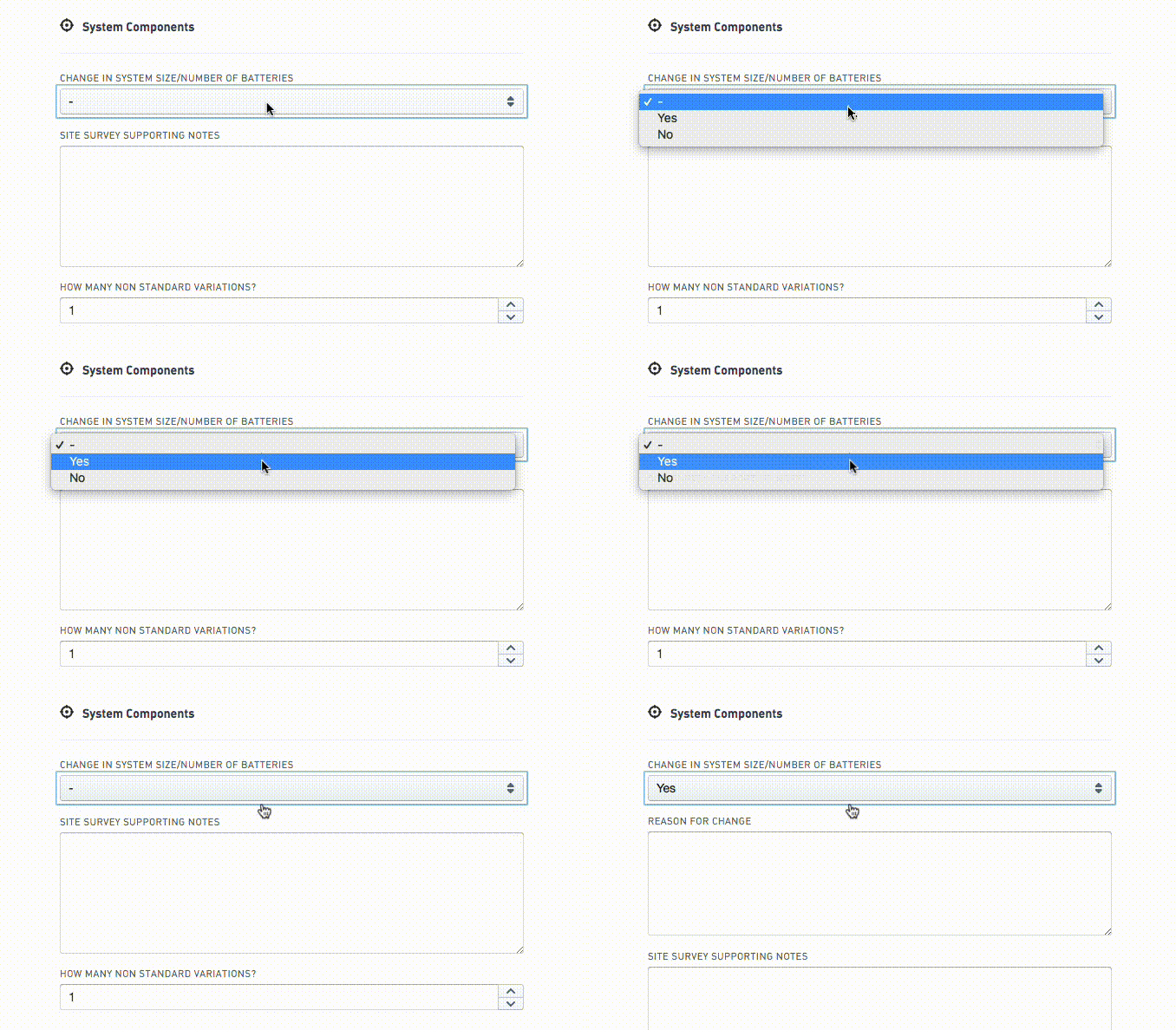
Each user has ‘role’ assigned to them. Roles are flexible; you can create as many roles as you want. Some examples of roles would be Installer, Inspector, Back Office, and Manager.
You can configure each role in order to only see relevant information according to their function.
For example:
- the Installer role doesn’t need to see dashboards and reporting
- An external contractor shouldn’t see the finances
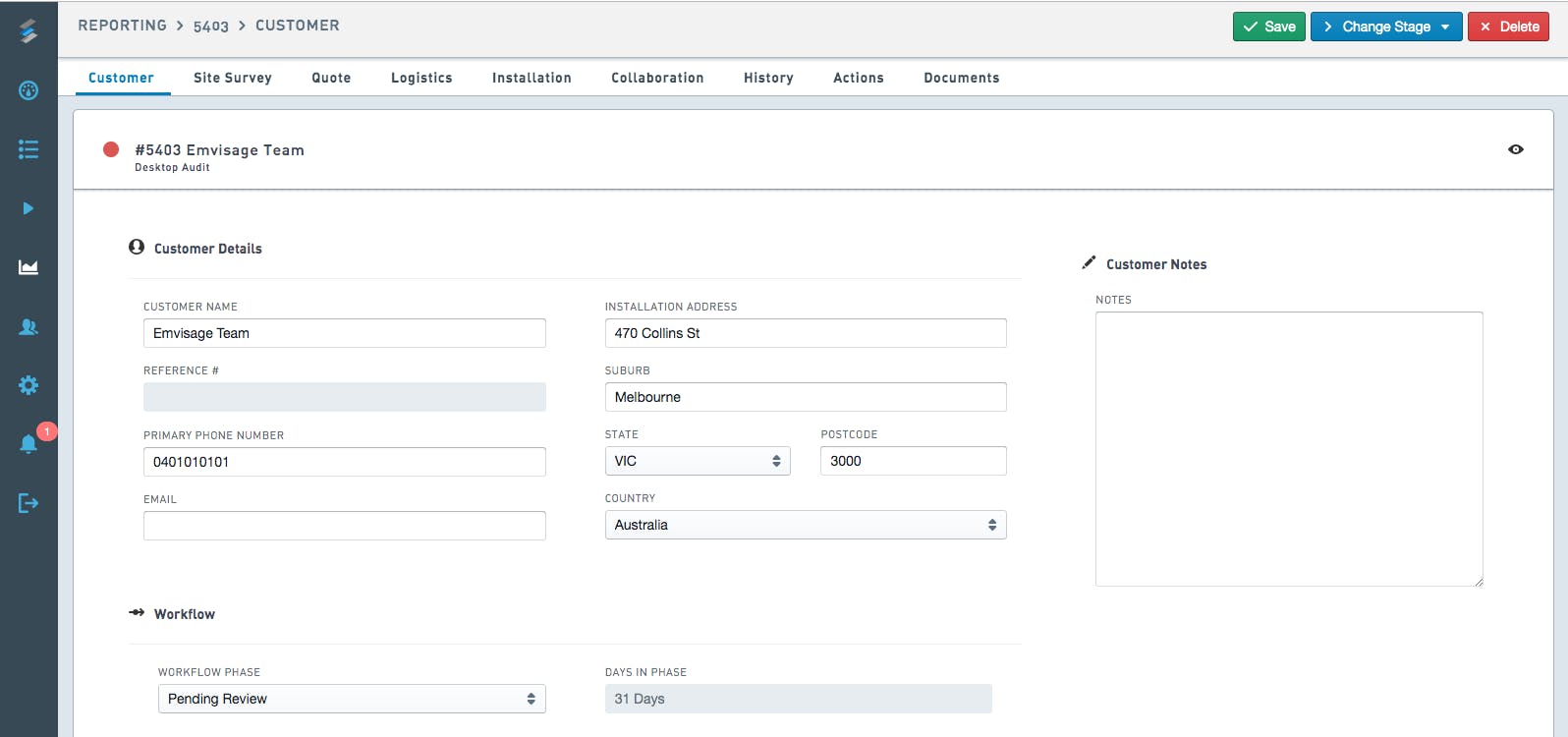 Manager View
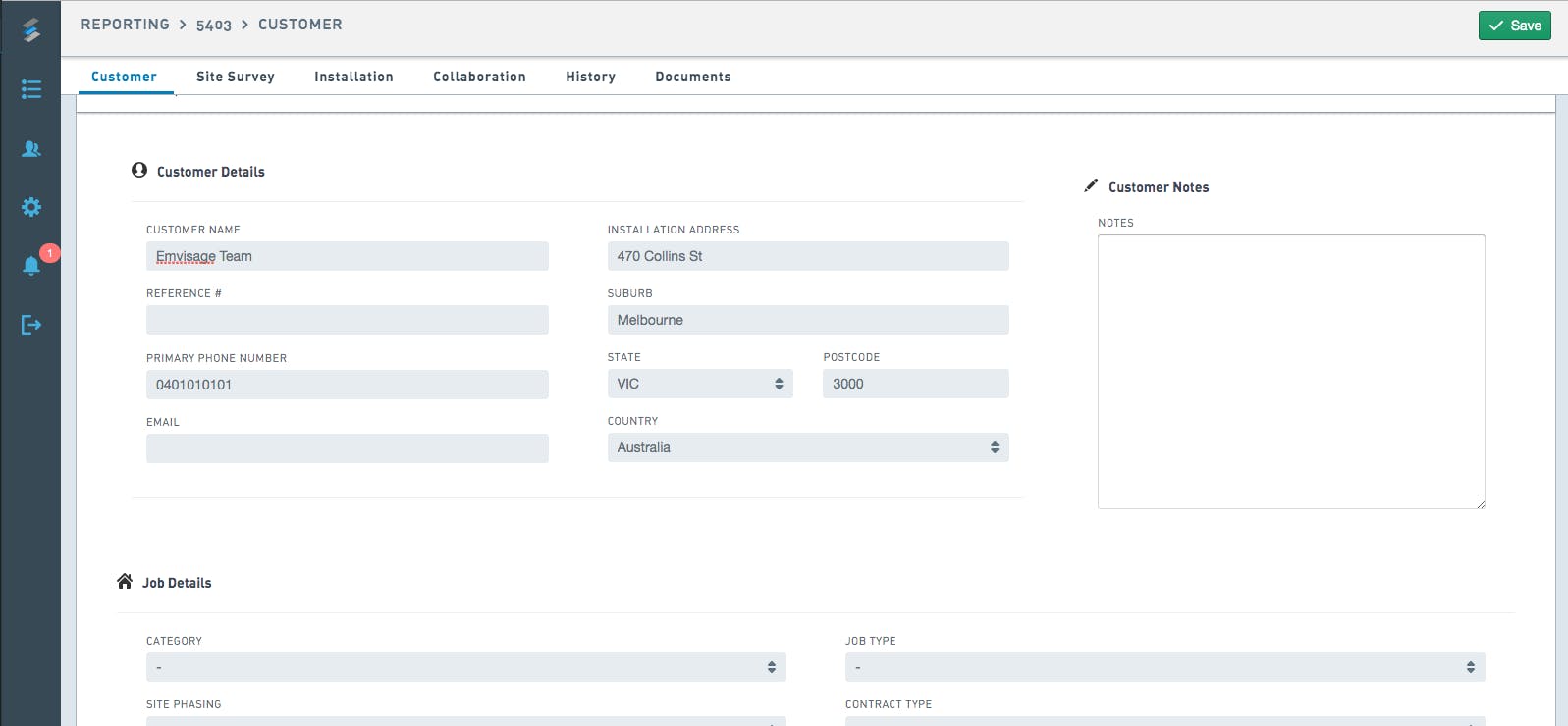 Installer View
Consistent layout - across multiple devices
Emvisage works on a wide range of devices. From 4K screen to small smartphones; the user interface stays as similar as feasible in an effort to reduce friction.
Custom-made software that trumps off-the-shelf products
Emvisage adapts to your business, not the other way around. Off-the-shelf products generally force you to:
- work within their framework
- use their vocabulary
Language and terms don’t seem so important at first glance. However, it can lead to errors and confusion when the same word has different meanings in different contexts.
One place to manage your installations, end to end.
From the first customer contact to final delivery, everything happens in one place. By using Emvisage you won’t need to have a multitude of software. Switching between software means changing context and that leads to more friction.
Intuitive UI and sophisticated UX offer more value than just a nice design of software. They play an integral part for teams and businesses, especially in the field service industry.
If you’re interested to learn more about Emvisage and how we help our customers streamline workflows and cut paperwork, visit our homepage: Emvisage Field Workflow Software.
